LOGO DESIGN LAS VEGAS
One Mark That Works Everywhere.
I drew the mark myself and every version derives from one vector master, so you can check any surface and find the same brand on it.
trusted by: UFC, Caesars Entertainment, Churchill Downs, Neighborly, Supercuts, City of Las Vegas, SDMI, Switch, Silverton, Panda Express, TAO, Ellie Mental Health, Dollar Loan Center, Dot Vegas Domains, HFC, Lithion Battery







Trusted by UFC, Caesars Entertainment, City of Las Vegas, Supercuts
“Justin's expertise, responsiveness, and genuine investment in our success have been evident throughout this process. We are truly grateful.”
at a glance
A vector logo system that survives a glowing screen and a printed card.
- the problem
- A new brand launched a website and a guest-upload app at the same time with no mark and no locked visual identity.
- who has it
- New and rebranding small businesses and service brands that need one mark to work across a website, a phone screen, social and print before launch.
- the pain
- A brand with no mark ships inconsistent surfaces, so the site, the app, the favicon and any printed material each look like a different company. A stock or template logo reads generic and undercuts a premium offer.
- cost of doing nothing
- A launch that looks unfinished and unmemorable, weaker trust at the moment a first customer is deciding, and rework later to retrofit an identity onto surfaces already in production.
- what shipped
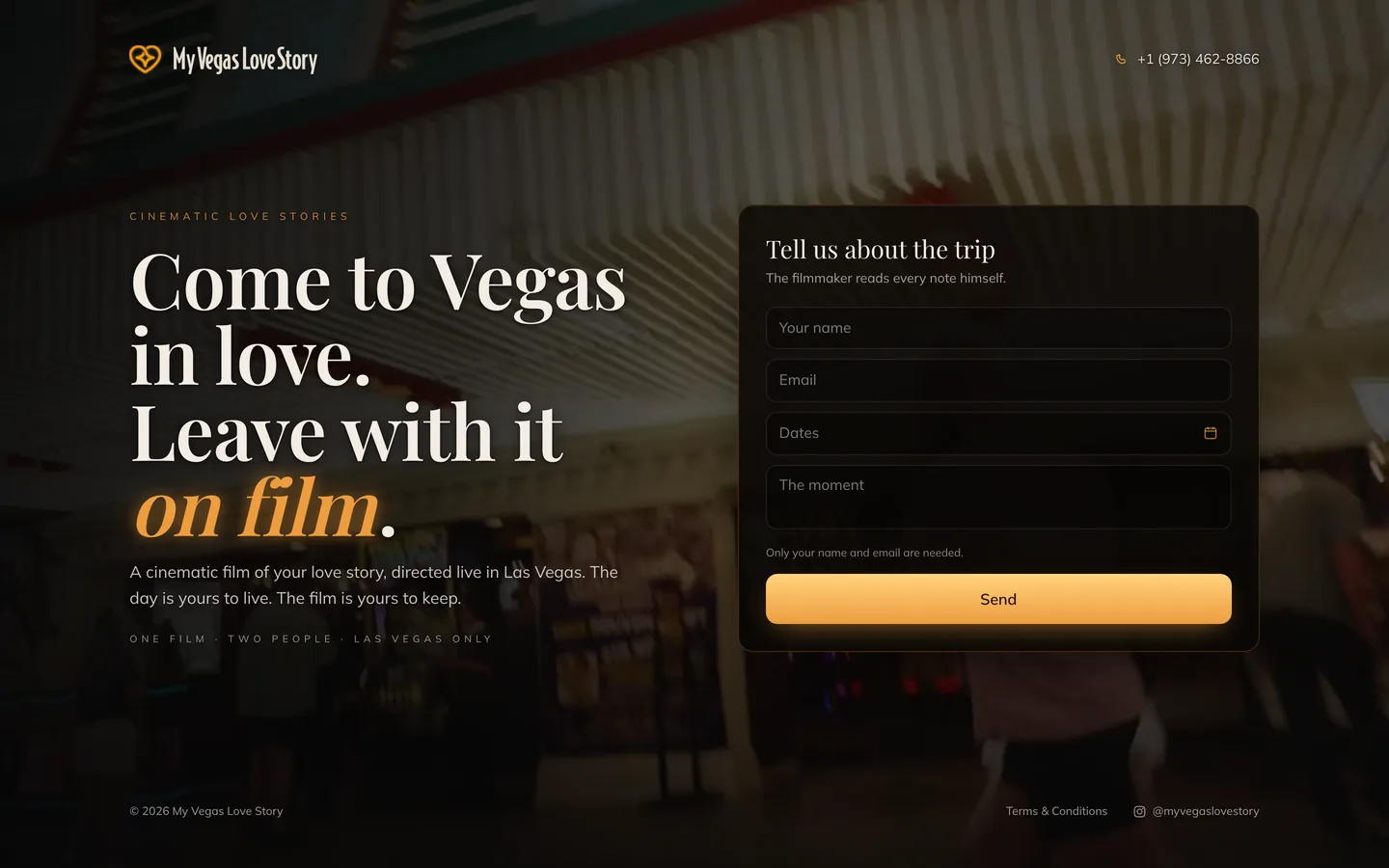
- A true-transparent WebGL neon-heart hero that floats over the brand own film footage with no dark rectangle behind it, a freeze-frame poster pulled from that same film so the first paint is already on brand, and a mobile-first bottom-sheet inquiry form that asks for a name and an email and nothing else. The heart is also the brand logo mark, drawn for this build.
01 · WHY MY LOGO LOOKS WRONG ON SOME SURFACES
Why a logo breaks on some surfaces.
A logo is the first thing a customer sees and the easiest thing to get half right. Most small businesses launch with one image file from a template marketplace or a free tool.
It looks fine in the one place it was made for and falls apart everywhere else. On a dark hero it shows a square box. On a printed card it is too low-contrast to read. In the browser tab the favicon is a blurry crop.
So the brand looks like three different companies across the surfaces a first customer checks. Real logo design is a system, not one file.
02 · BRAND IDENTITY LAS VEGAS
What the identity deliverable includes.
I designed the Neon-Heart Identity for My Vegas Love Story, a brand launching a website and a guest-upload app at once. The deliverable was an identity built to work on every surface from one source. A logo was one piece of it.
03 · NEON LOGO DESIGN
How the neon logo renders transparent.
The signature surface is the website hero, where the heart appears as a real neon sign that pulses over the background. The hard part is transparency.
A normal video of a glowing sign carries a solid rectangle behind it, so on a light background you get a dark box. I solved that with a true-transparent render: a stacked-alpha treatment that gives the neon its own transparency channel. I proved it on two browser engines over a bright magenta test background, where any hidden box would have been obvious.
A page-open sequence then ignites the sign and rises the wordmark in, so the brand introduces itself with motion instead of a static drop-in.
04 · CAN A LOGO WORK IN PRINT AND ON SCREEN
How one logo serves print and screen.
A neon mark that looks brilliant on a dark screen has the opposite problem in print, because a low-contrast glow does not scan well.
Because the identity started as a vector I could derive a physical version from the same source. For the printed card guests scan at the event, I flattened the mark to high-contrast deep-on-cream and verified with a camera that it decodes, after an orange-on-black version failed the scan.
The same heart became the favicon on both the website and the guest-upload app, so the brand reads consistently wherever a visitor lands.
05 · SMALL BUSINESS LOGO DESIGN
Why a vector logo system protects you.
A service business lives on first impressions. Somebody finds you on a phone, checks the site, maybe reads a card, and decides in seconds whether you look like a real operation.
Building it as a vector system also protects the future. When the brand grows into new collateral or a larger sign, the master is already there and the variants derive from it, instead of retrofitting one old image file onto everything.
That is the difference between a logo you bought and an identity you own.
06 · WHAT LOGO AND BRAND DESIGN COSTS
What logo and brand design costs.
Brand and design is $1,000/month. Same number I quote everybody, printed here instead of held back for a call. Two services together are $1,799 and three are $2,499. No setup fee.
No setup fee, three months, then month to month, and you own the vector master and the full variant set. Source files are the deliverable.
07 · COMMON LOGO DESIGN QUESTIONS
Logo design questions.
What does logo design include?
Why does my logo show a dark box on my website?
Can the same logo work in print and on screen?
Do I get the source files?
Is this only for businesses here?
08 · GET FREE AUDIT
Get the free audit.
If your mark looks like a different company on your site, your card and your browser tab, that is costing you trust while somebody is deciding.
I crawl your whole site, score it 0 to 100, and send a ranked list of what is costing you customers. About a day. No call needed.
If the fix is not something I do, I will say so.
who did the work
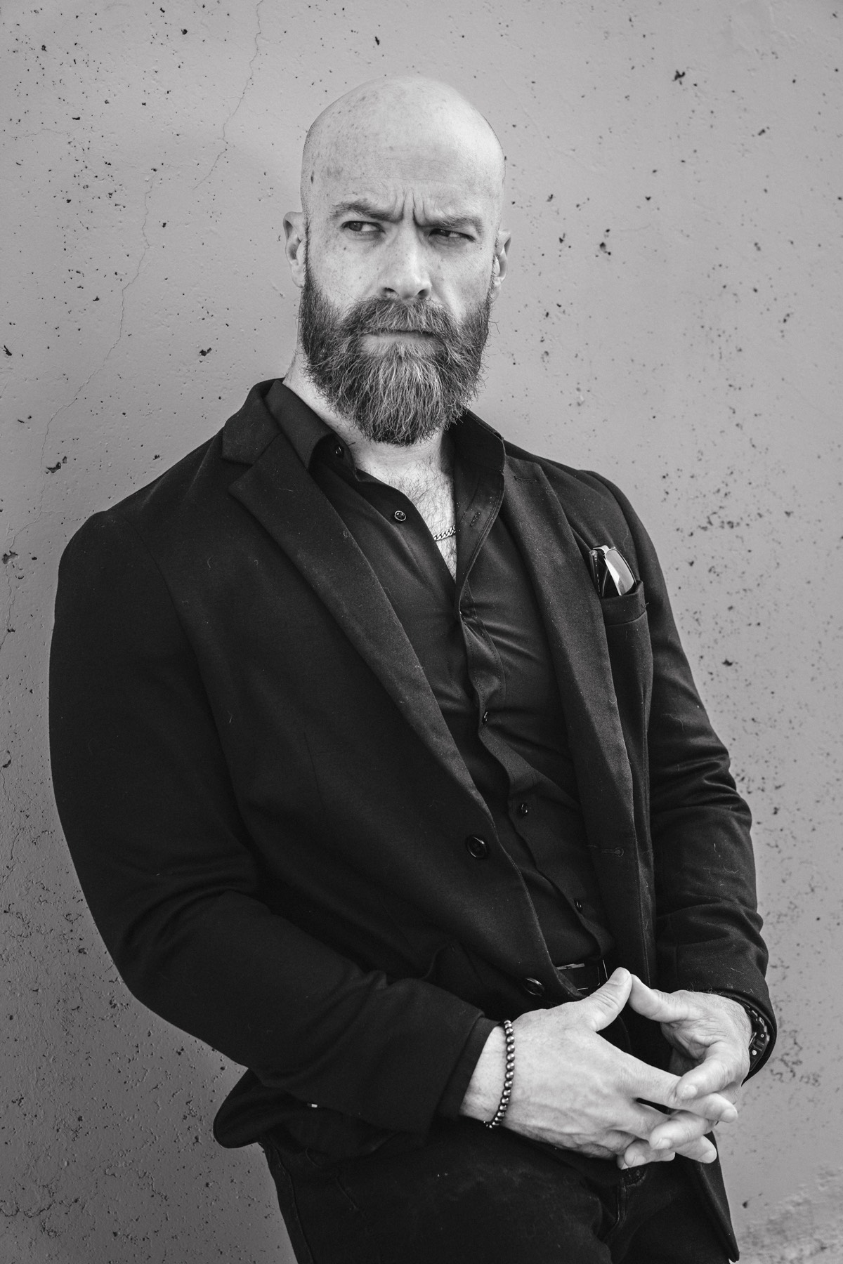
I do identity work in this town, and this one is named.
I have been at this in the Valley for fourteen years, for north of three hundred businesses.
The person you hire is the person doing the work.